
About the Project:
ASL Scope
ASL Scope is a Deaf coaching and consulting practice founded by Sean Cosslett. The work supports interpreters, students, and professionals who want to deepen their American Sign Language fluency, sharpen their interpretation, and engage authentically with the Deaf community.
Sean came in without a formal brand. He had a clear vision, a growing client list, and a teaching philosophy rooted in partnership rather than instruction. What he needed was a visual identity that could carry that voice, one that felt human and welcoming, but also serious enough to stand alongside the interpreters and educators he works with.
The brand had to reflect the heart of the practice: a Deaf perspective at the center, with room for every learner to grow into their own scope.
My Role: Brand Identity and Illustration
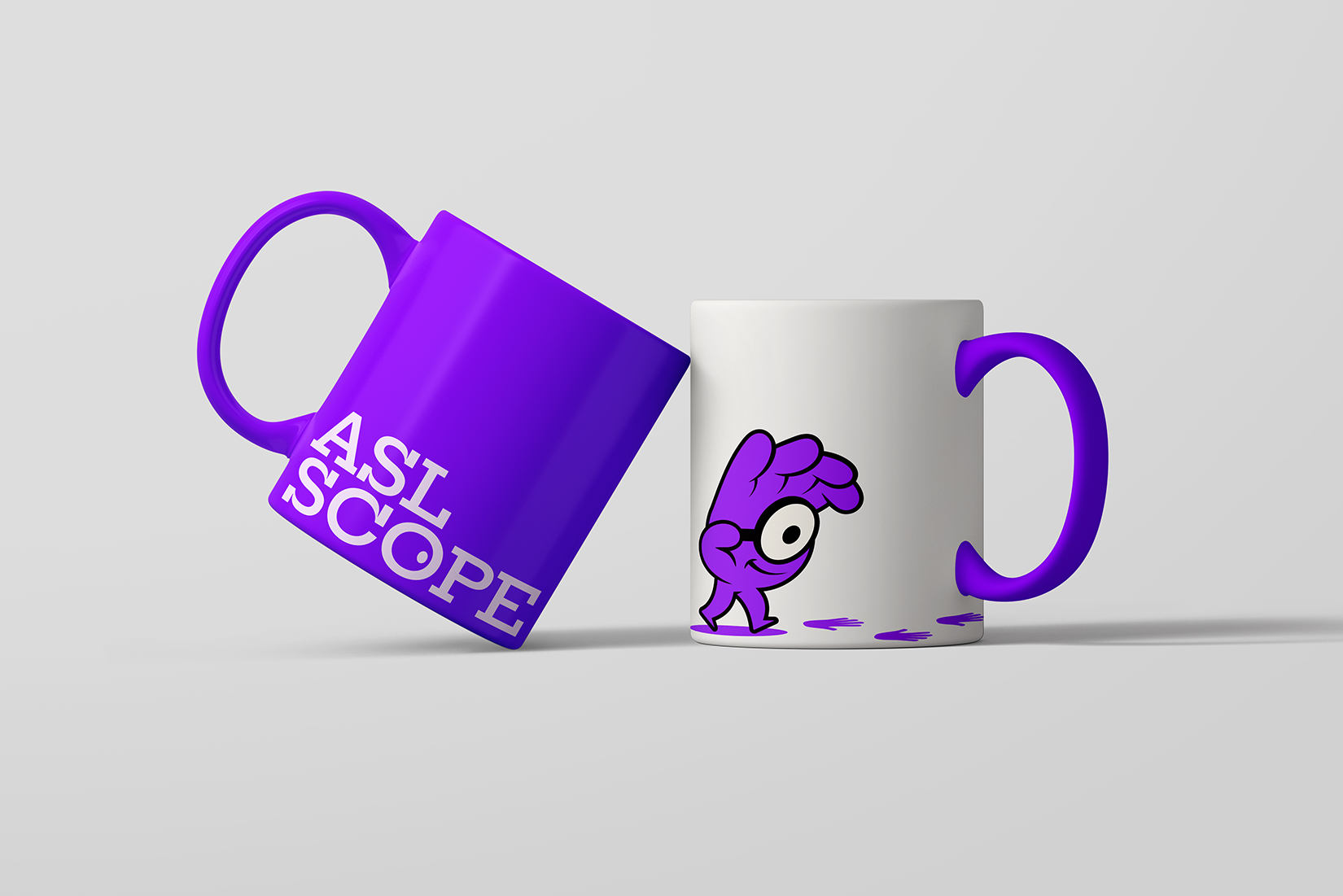
I led the identity from positioning through delivery, developing the visual system that carries Sean's voice across every touchpoint. The work included brand strategy, the logo and mark, an accompanying color and type system, and a set of custom ASL handshape illustrations made to live throughout the brand.
Throughout the process, Sean and I worked side by side. Conversations shaped every choice, from the slope of a handshape illustration to the weight of a logo curve. The goal was never to design at him, but with him, so the brand felt like an extension of how he already shows up for his clients.
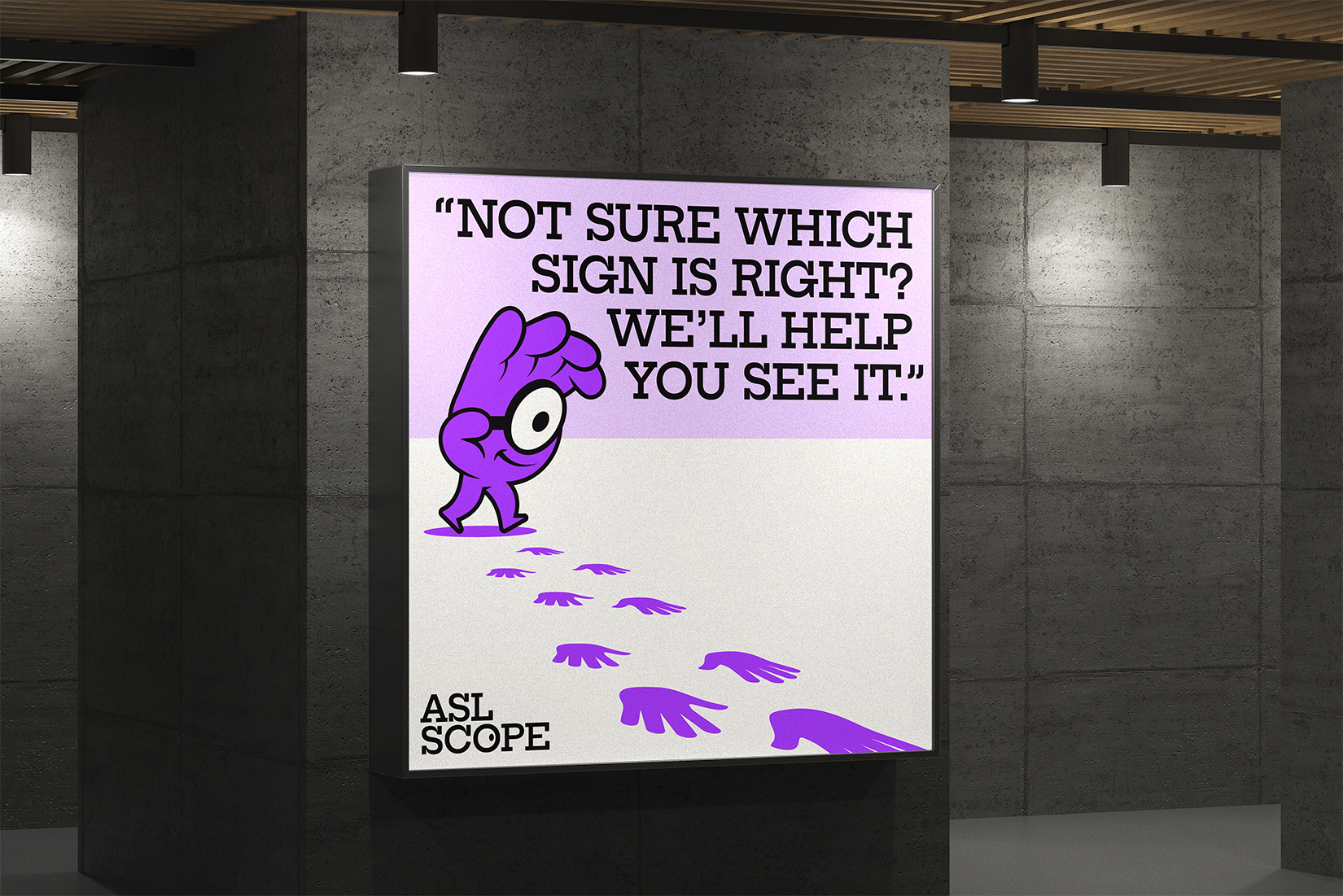
A Deaf-centered approach guided every decision. From the way ASL was represented visually to the spirit of the marks themselves, each element was chosen to honor the language and the people it serves.


Designing with a Signed Lens at the Core
The project began with listening. Before sketching a single mark, I spent time understanding Sean's practice, his clients, and the small moments that make ASL coaching feel different from a language class. That foundation kept the identity honest and specific to his work.
The handshape illustrations A, B, and C became the visual through-line of the system, doubling as quiet motifs that nod to the language without ever shouting. They give the brand a recognizable rhythm and a sense of identity that's grounded in ASL itself rather than borrowed from somewhere else.
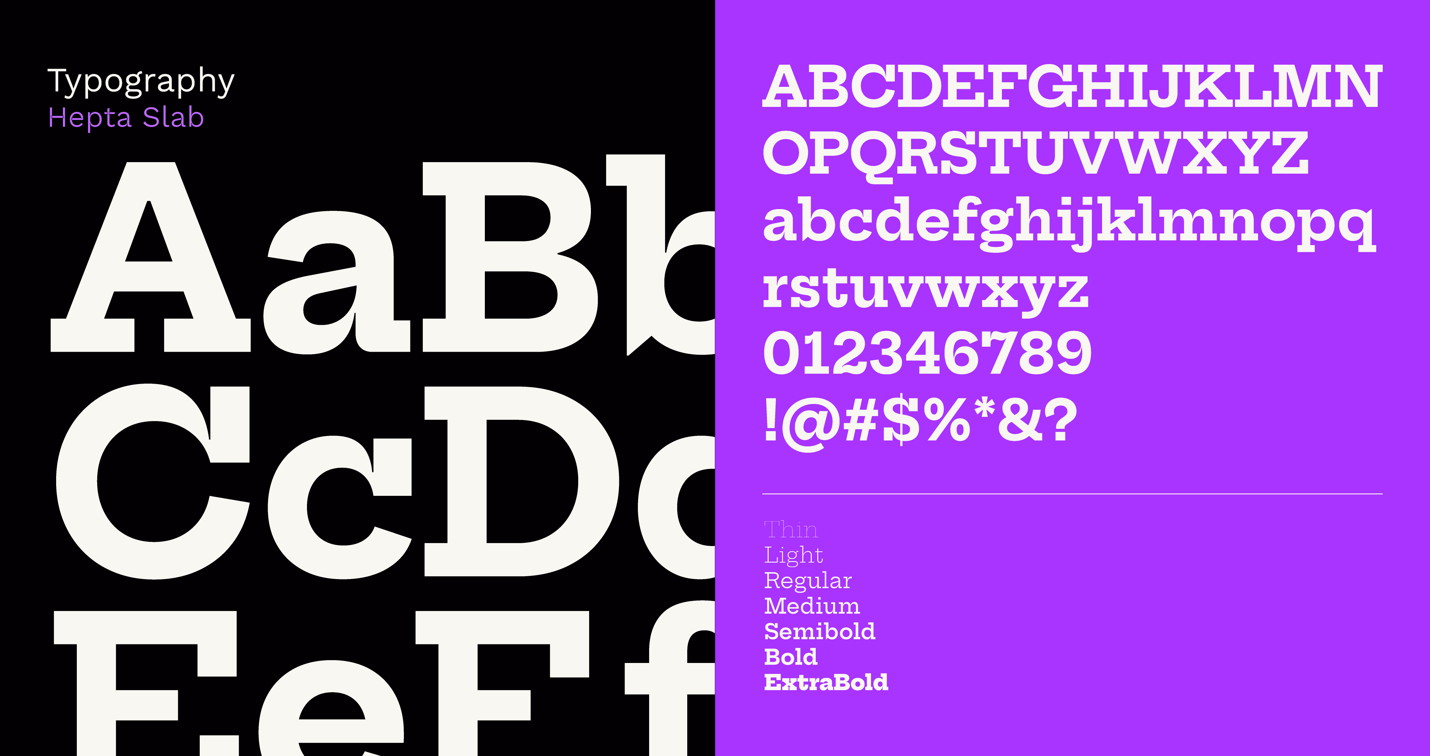
A purple accent color anchors the palette, paired with a calm white and gray base that lets the marks and illustrations breathe. Type pairs Hepta Slab with Archivo and IBM Plex Sans — the slab carries warmth and personality in the headlines, while the sans serifs hold the structure underneath.
Design Outcome
The result is a complete brand identity for a Deaf practice built around connection, fluency, and trust. Deliverables included a logo system, a color and type system, brand guidelines, and a set of custom ASL handshape illustrations designed to extend across the full brand.
The identity feels warm and grounded. The signed lens stays at the center through the marks, through the illustrations, through the tone the brand carries while the system stays clean enough to grow with the practice.
ASL Scope now has a brand that reflects what Sean has been doing all along: meeting people where they are, and helping them expand their scope.
Ready to leap forward?
Your brand deserves to be seen. I am ready when you are.