
About the Project:
Donny's Dogs
Donny’s Dogs is a Deaf owned street food business serving corn dogs with bold flavors and a big personality. The stand shows up in busy street markets where quick attention and clear branding matter.
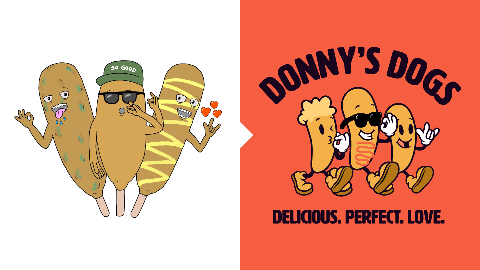
Before we worked together, the business relied on an older logo that functioned more like an illustration than a true identity system. It did not scale well across signage, packaging, or social media, and it lacked the clarity and impact needed to stand out among nearby vendors.
The goal was to evolve Donny’s Dogs into a recognizable brand that felt confident, memorable, and easy to spot from a distance. The new identity needed to attract customers quickly, communicate personality, and support the business across every touchpoint.
My Role: Brand Strategy and Visual Identity
I led the brand strategy and visual direction, transforming the existing logo into a complete identity system. This included developing the logo suite, defining the color palette, and creating supporting elements for signage, packaging, and social media.
I collaborated closely with Donny throughout the process to ensure the brand reflected his energy, humor, and connection to the community. The focus was not just aesthetics, but building something authentic that truly represented the experience of visiting his stand.
As a Deaf owned business, the project also held personal meaning. I wanted the identity to celebrate culture and communication while remaining welcoming to everyone.
.jpg)
Bringing the
Brand to Life
The project began with discovery and research. I studied competitors, observed how street vendors attract attention, and explored ways the brand could communicate quickly in a crowded environment. Moodboards helped define an energetic and playful direction while early sketches focused on balancing clarity with personality.
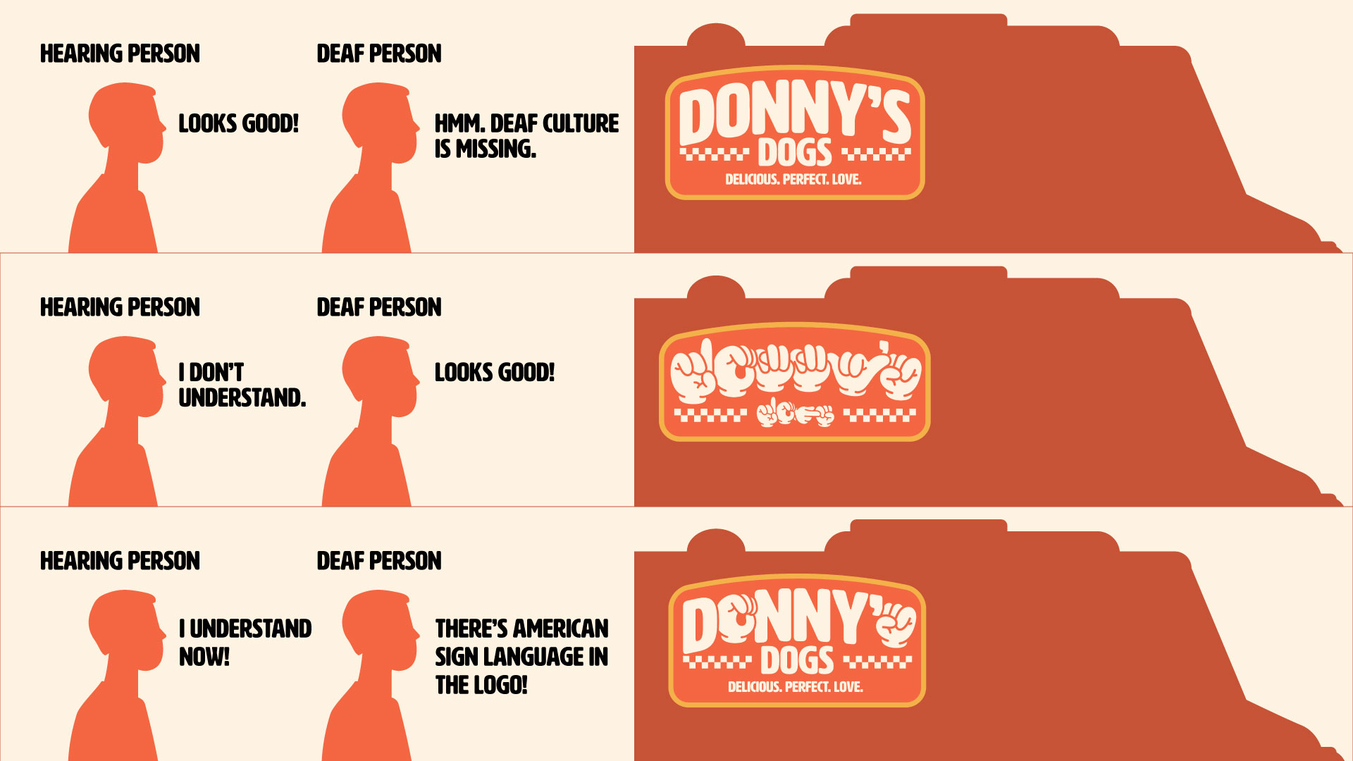
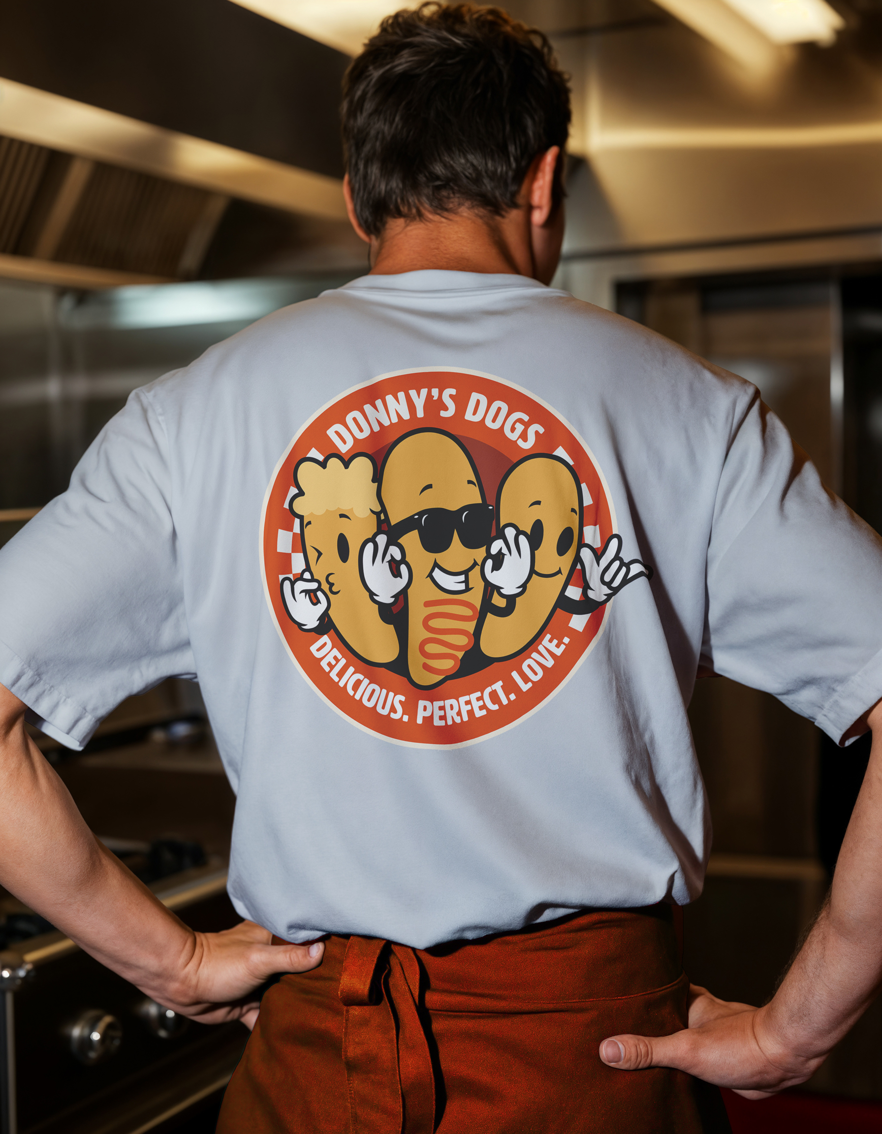
A defining idea emerged from Donny himself. His slang and expressions became part of the visual language. Words like Delicious, Perfect, and Love were translated into American Sign Language and subtly integrated into the letterforms of the logo. This allowed the brand to communicate in both English and ASL at the same time.
The visual style drew inspiration from 1960s cartoon graphics. Simple shapes, bold outlines, and vibrant colors created a look that feels friendly, expressive, and easy to recognize from a distance.
Every decision prioritized legibility, energy, and appetite appeal to ensure the brand worked effectively in real street settings.
dESIGN OUTCOME
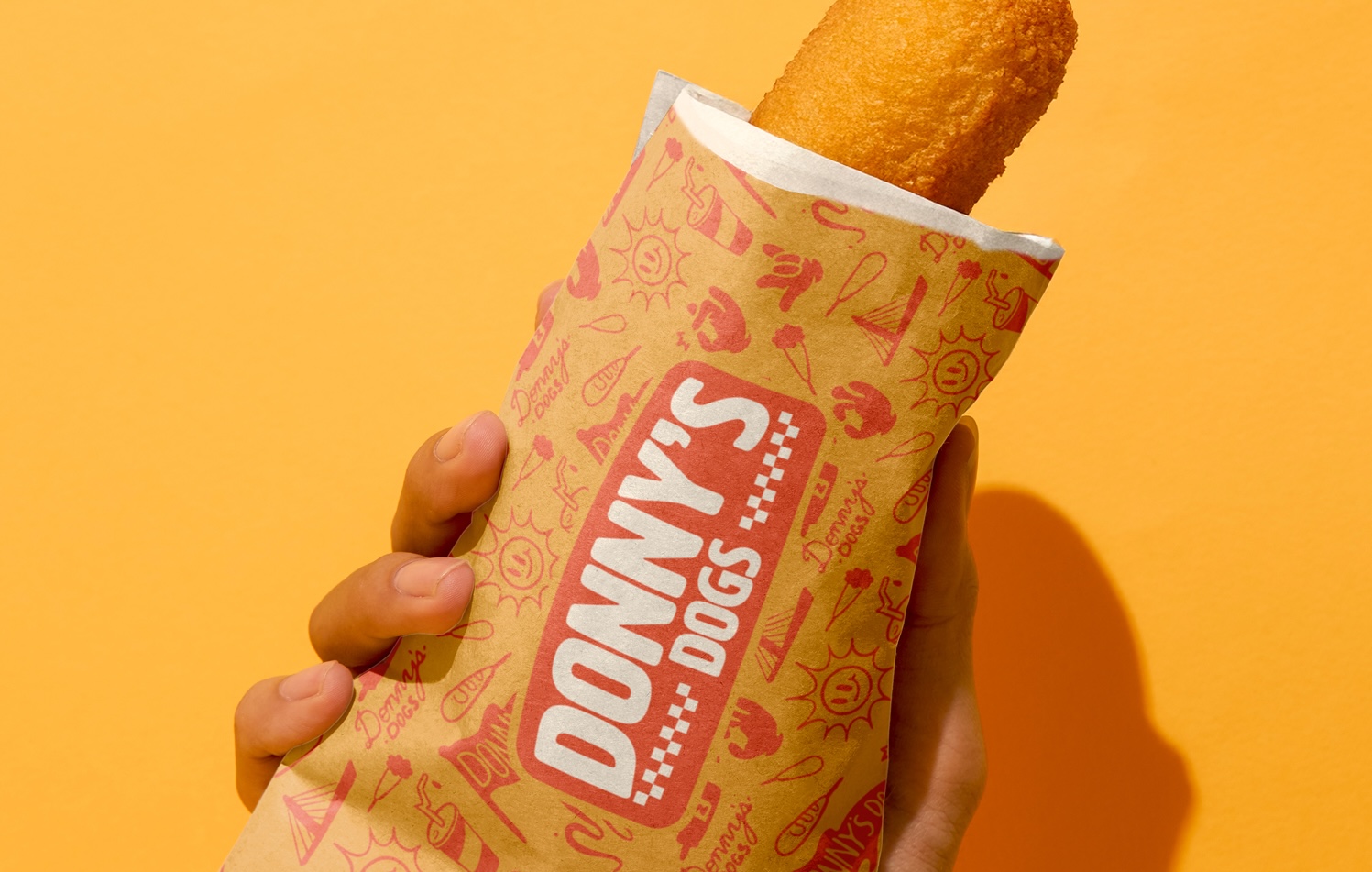
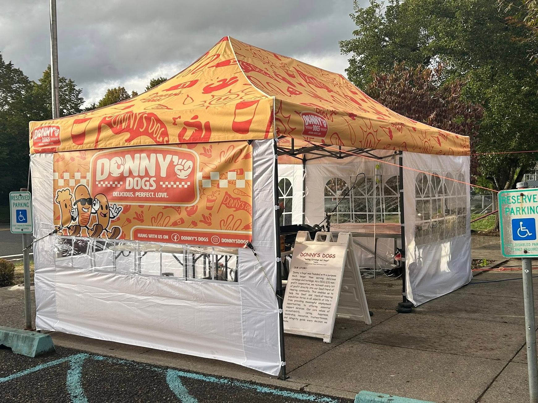
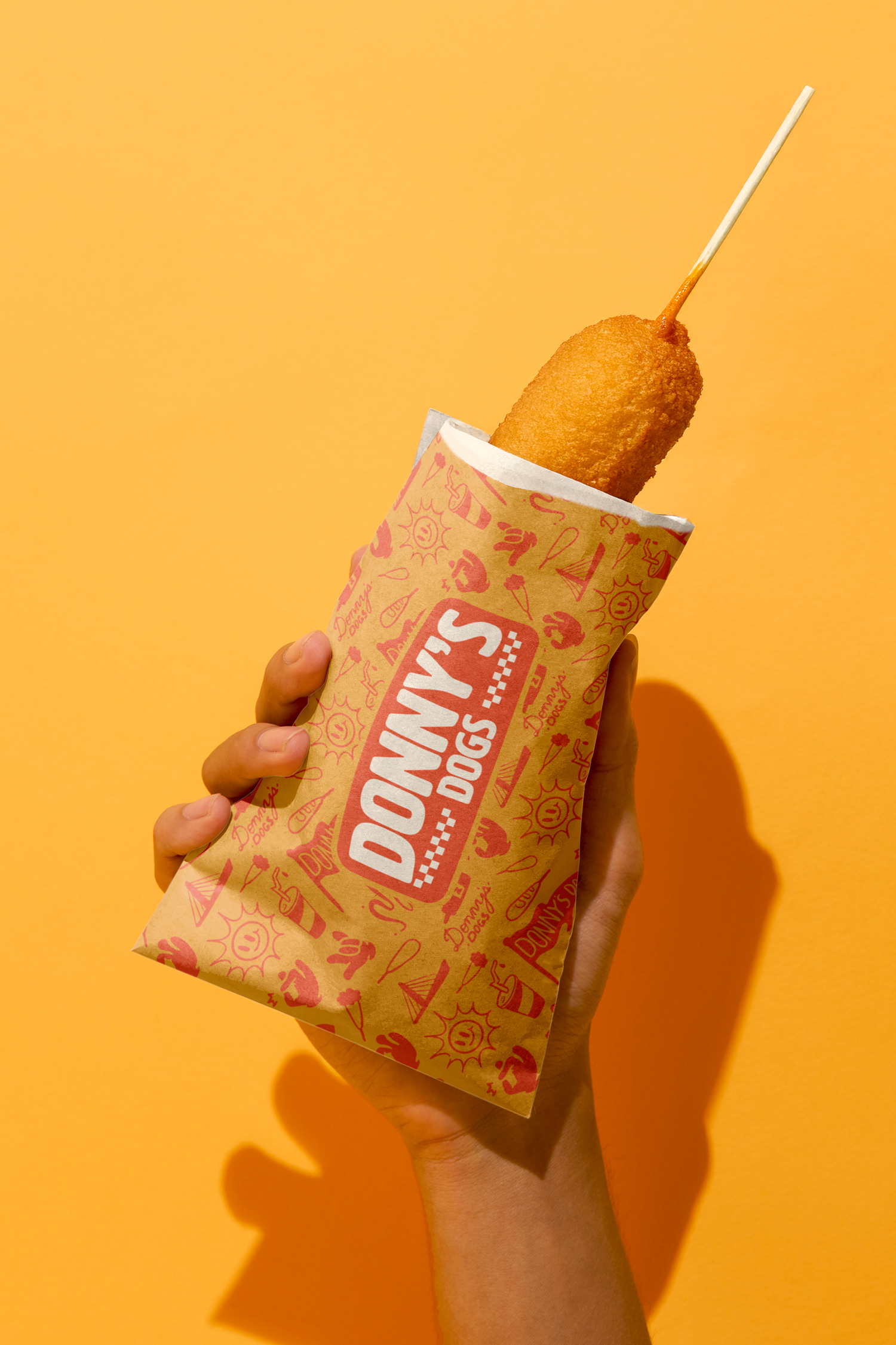
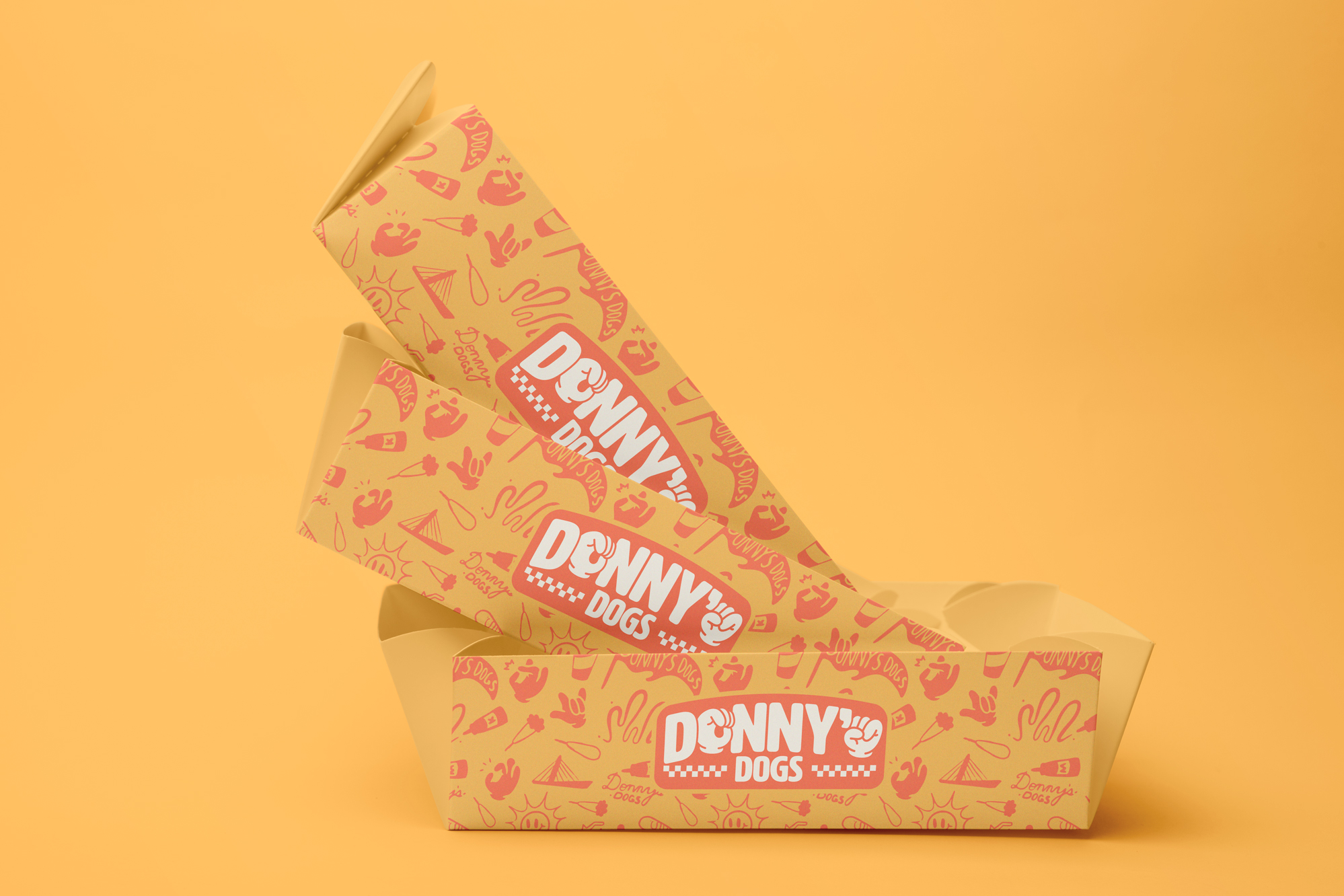
The final identity system includes a refreshed logo suite, vibrant color palette, typography, and flexible brand assets that extend across food wraps, shirts, packaging, and social media.
The result is a cohesive brand that feels joyful, approachable, and unmistakably Donny’s Dogs. By integrating English and ASL within the design, the identity communicates on multiple levels and reflects both the food and the community behind the business.
After launch, Donny shared that the new branding attracted more attention at the stand and helped increase sales. Seeing the identity succeed in the real world and resonate with customers made the project especially rewarding.
Ready to leap forward?
Your brand deserves to be seen. I am ready when you are.