About the Project:
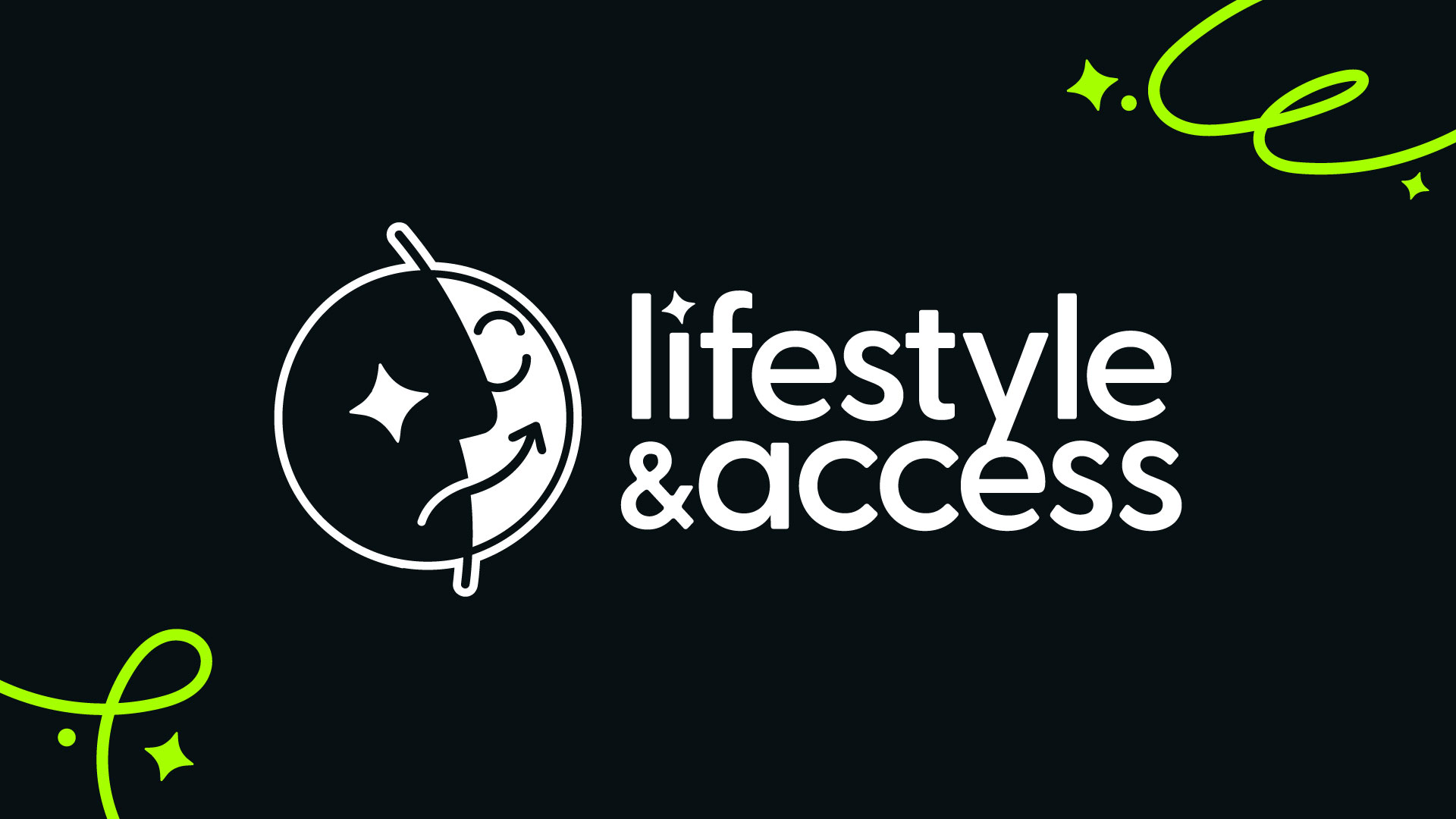
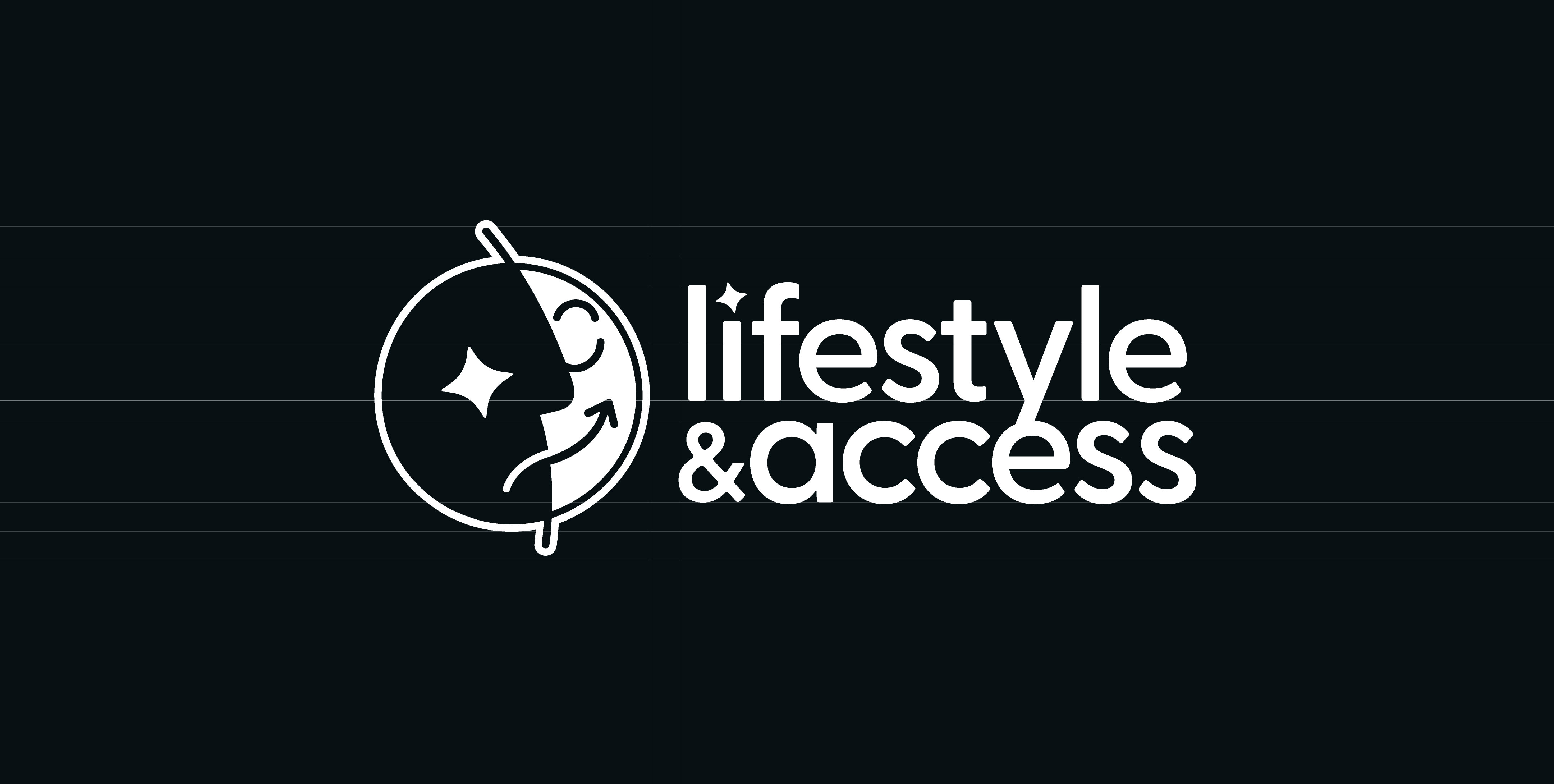
LIFESTYLE & ACCESS
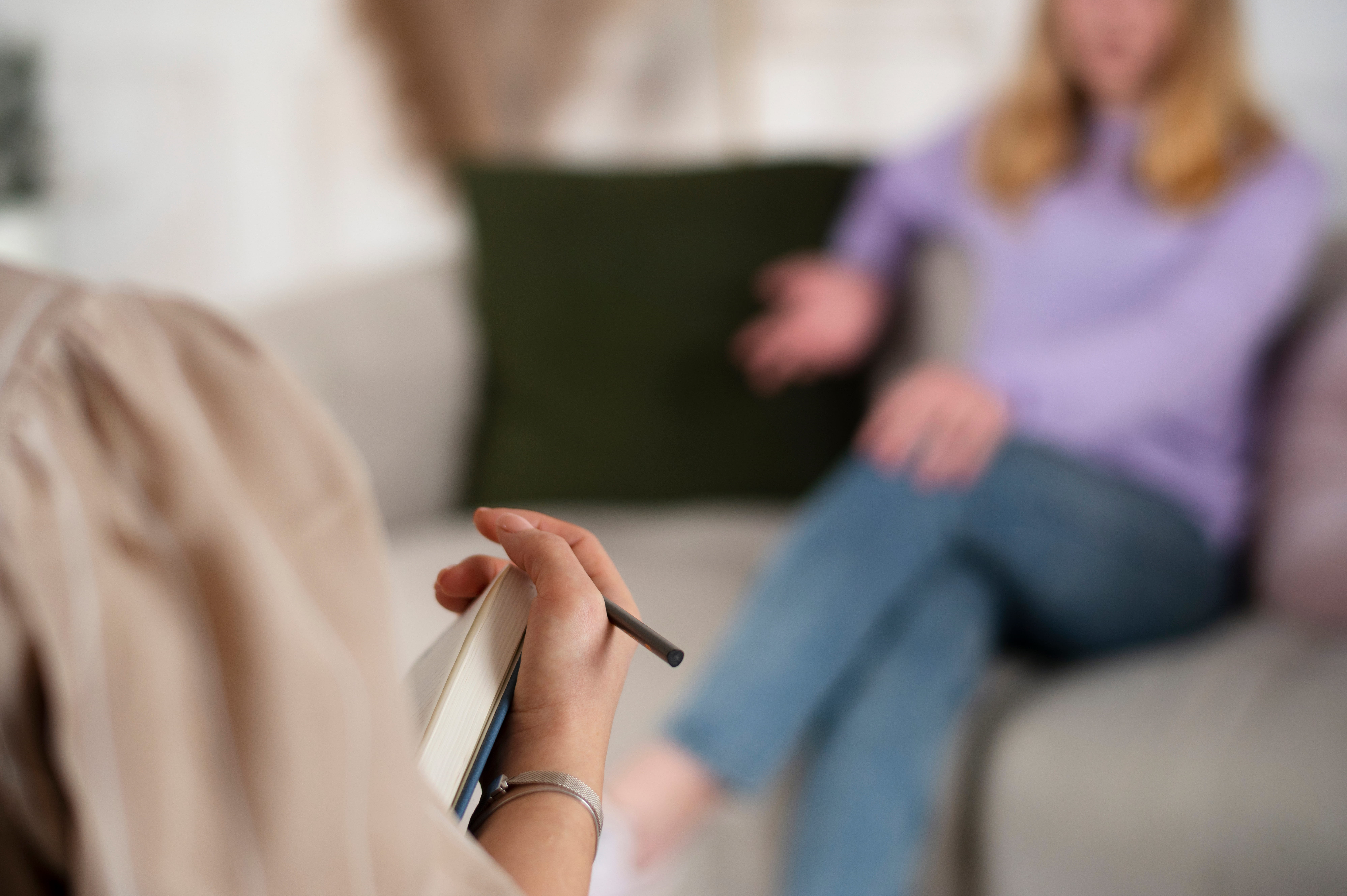
Lifestyle & Access is a startup focused on creating inclusive solutions for blind and low vision communities. Their mission centers on accessibility, dignity, and real human connection, helping people navigate everyday life with greater confidence and independence.
As a new business, they were starting from scratch without a visual identity. They needed a brand system that could clearly communicate their purpose while being intentionally designed for people with a wide range of visual abilities. Accessibility was not an added feature. It needed to be built into the foundation of the brand itself.
The goal was to create an identity that felt human, approachable, and trustworthy. Rather than appearing clinical or corporate, the brand needed to reflect lived experience and genuine care for the people it serves.
My Role: Strategy, Accessibility, and Visual Direction
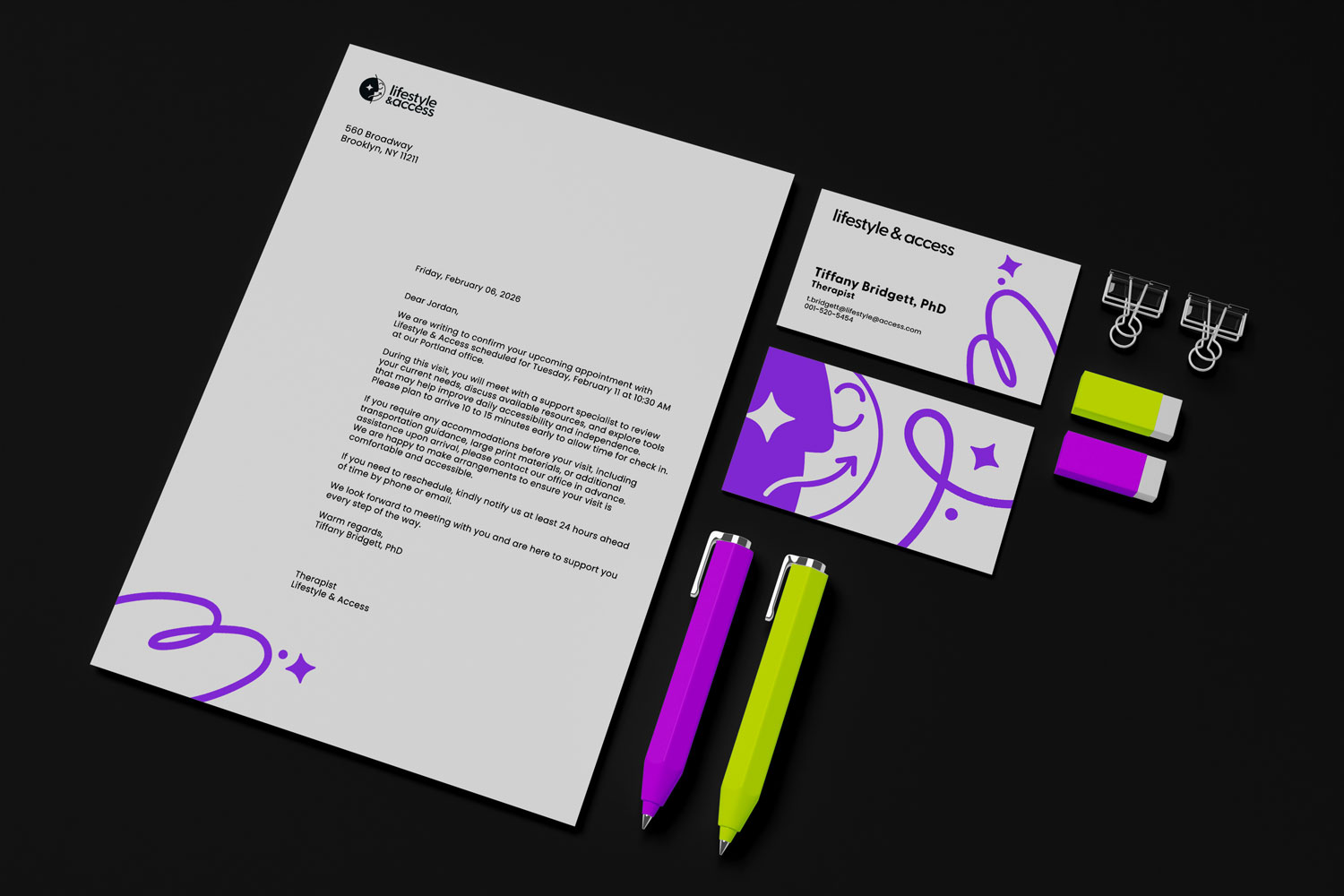
I led the project from strategy through execution, developing a complete accessibility first visual identity system. My work included brand positioning, logo design, an accessible color palette, typography, and flexible assets that could scale across digital and print touchpoints.
Throughout the process, I collaborated closely with the founders through open conversations and shared values. The goal was to design with them, not simply for them, ensuring the brand authentically represented their story and mission.
Accessibility guided every decision. From color contrast and hierarchy to layout and tone, each element was crafted to support clarity, comfort, and ease of use for blind and low vision users as well as their families and support networks.
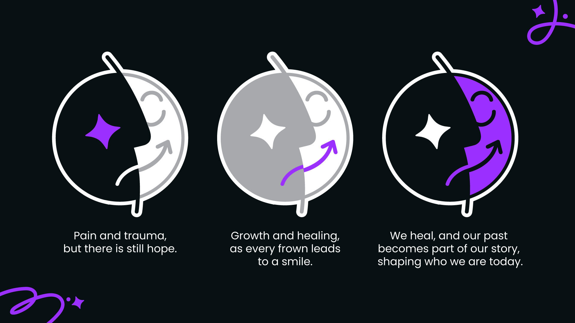
Designing with Accessibility at the Core
The project began with discovery and research. Before exploring visuals, I focused on understanding the team’s experiences, values, and the real challenges faced by blind and low vision individuals. This foundation ensured the identity was driven by meaning rather than decoration.
Design started with clarity. High contrast color combinations were prioritized to improve readability for low vision users, while simple structure and strong hierarchy made information easier to interpret quickly. Layouts were kept clean and organized, with clear spacing and separation between elements to reduce visual strain and cognitive overload.
During exploration, purple and green were tested as primary colors. However, it became clear that a minimal black and white palette provided stronger accessibility and better aligned with the brand’s purpose. Accent colors were used selectively, while clarity remained the priority.
Every choice supported one question: is this easier to understand, navigate, and use?
Design Outcome
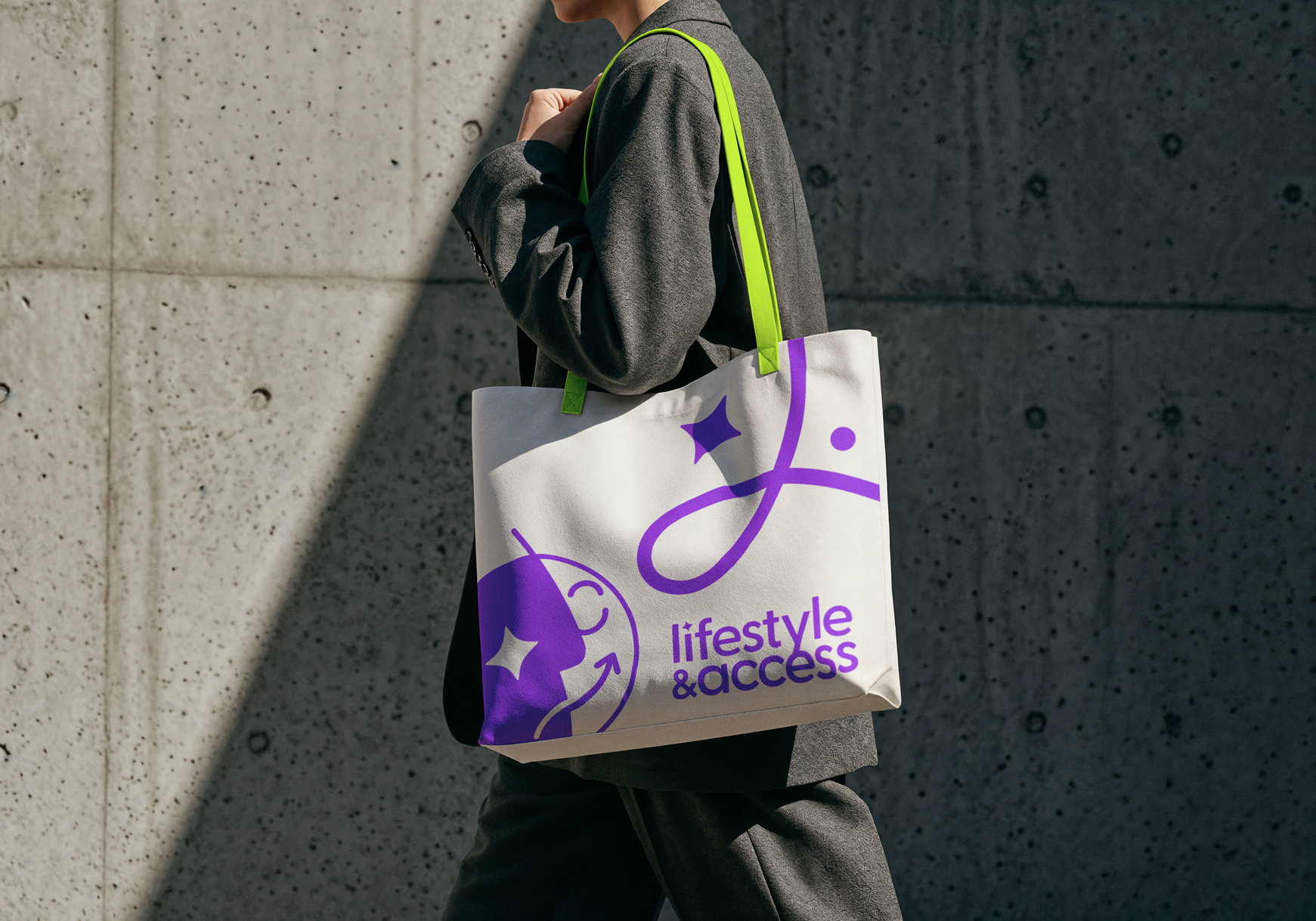
The final result is a complete, accessibility first brand system built for clarity and growth. Deliverables included a logo suite, brand guidelines, social media templates, and supporting assets designed to work consistently across all touchpoints.
The identity feels calm, welcoming, and human. High contrast visuals, clear structure, and thoughtful spacing make the brand easier to recognize and navigate for blind and low vision users while remaining approachable for everyone.
By leading with people rather than polish, Lifestyle & Access now has a brand that reflects its values and builds trust from the first interaction. The system not only communicates what they do, but demonstrates their commitment to inclusion through every design detail.
Ready to leap forward?
Your brand deserves to be seen. I am ready when you are.