
About the Project:
NATIONAL BASS
ASSOCIATION OF
THE DEAF
The National Bass Association of the Deaf is an organization that hosts fishing tournaments and events for the Deaf community across the United States. Beyond competition, NBAD creates space for connection, friendship, and shared experience, bringing people together through sport and community.
Over time, their existing logo began to feel dated and inconsistent across modern applications. It lacked the clarity and flexibility needed for apparel, event signage, digital platforms, and promotional materials. As the organization continued to grow, they needed an identity that felt more professional, recognizable, and built to last.
The goal of this project was to redesign the logo and create a stronger visual foundation that honored NBAD’s history while presenting a cleaner, more confident look for the future.
My Role: Brand Strategy and Visual Identity
I led the redesign from concept through final delivery, developing a refreshed logo and cohesive visual system that could support the organization across tournaments, merchandise, and communications.
My responsibilities included logo design, typography direction, color refinement, and building a flexible system that would remain clear and legible at any size, from small patches and apparel to large banners and event graphics.
As a Deaf designer, I also brought a cultural perspective to the work. I understood how important it was for the identity to feel authentic to the community while still looking polished and professional to outside audiences and sponsors.
.jpg)
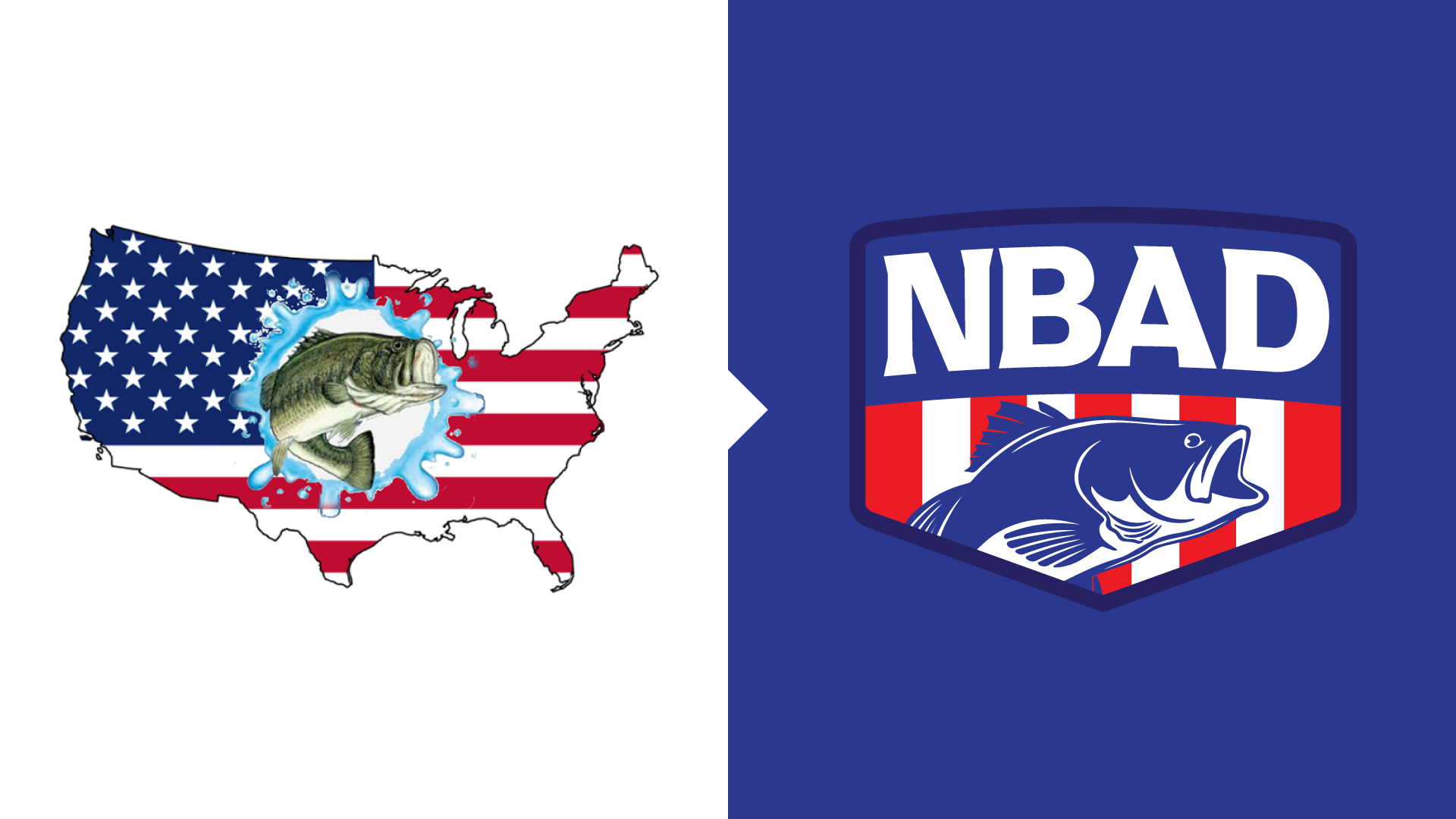
Balancing Tradition with Modern Clarity
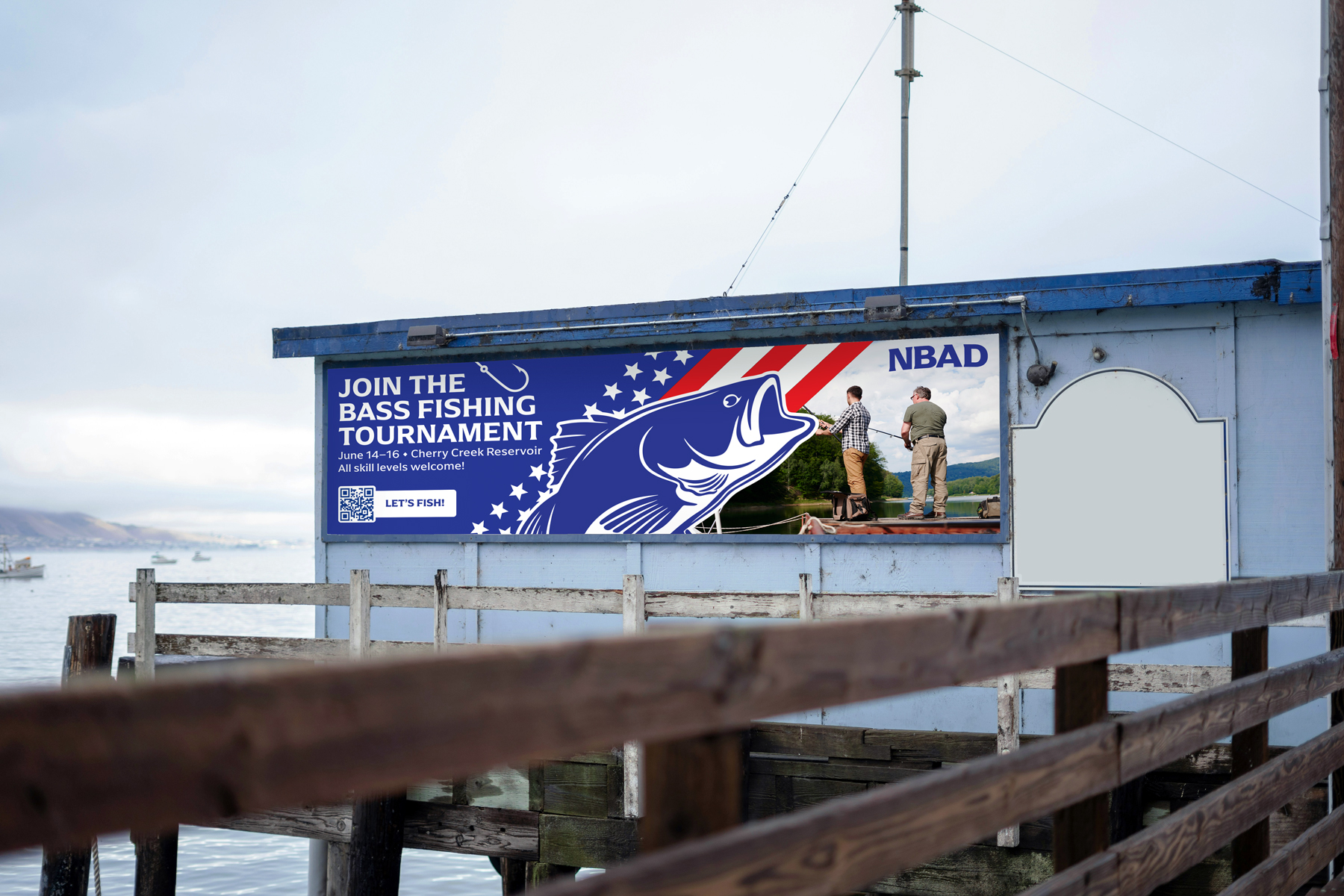
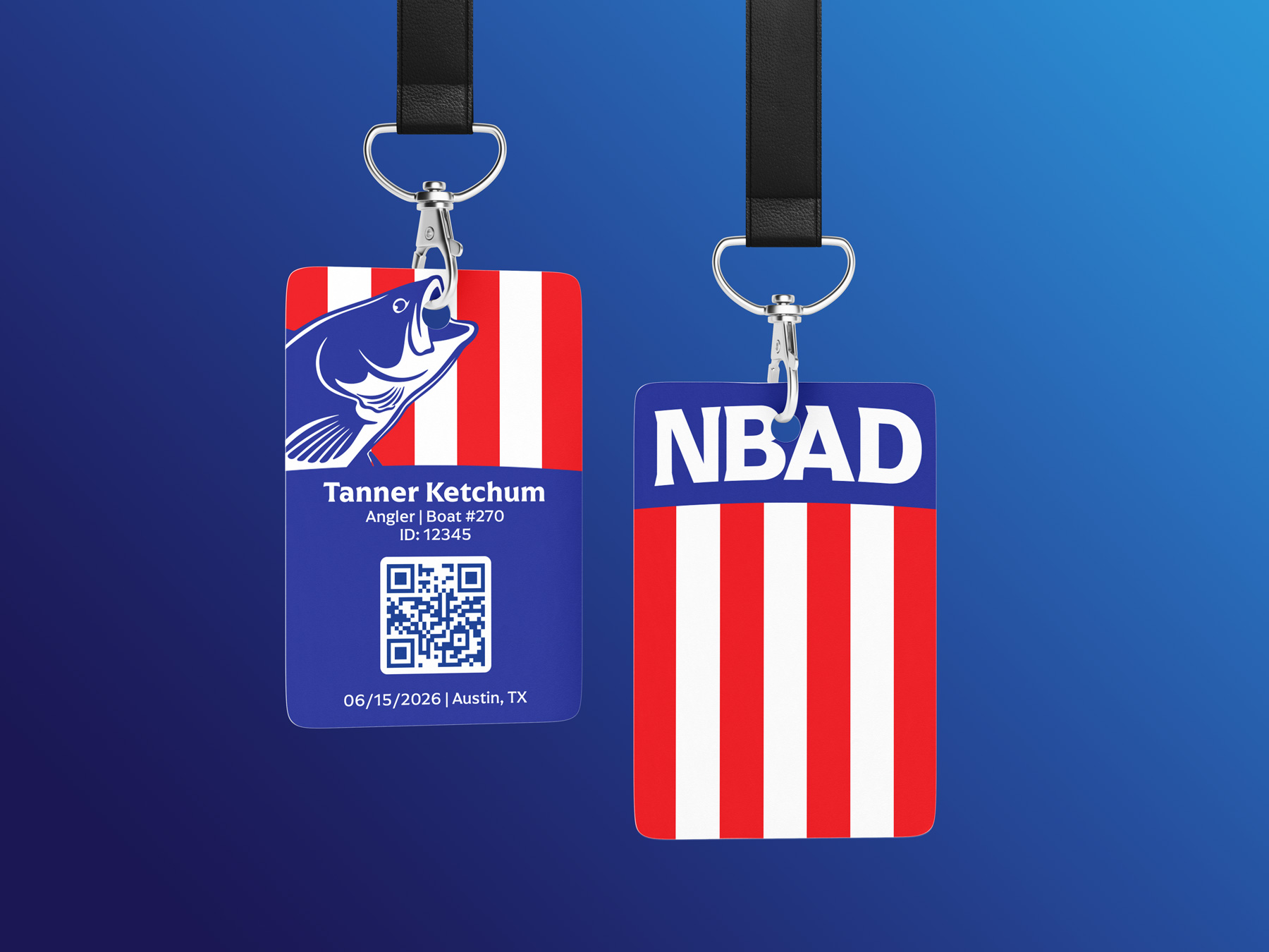
The process began with research into NBAD’s history, values, and how the logo was used in real situations. Tournament jerseys, boat decals, patches, and signage all required a mark that could remain strong and readable in motion and at a distance.
Early explorations focused on simplifying shapes, strengthening contrast, and improving overall balance. The goal was not to completely reinvent the organization, but to evolve it.
The new direction emphasized clean geometry, stronger structure, and improved legibility. Details that felt cluttered or dated were refined into a more timeless form. Typography was selected for clarity and durability, ensuring the logo could perform consistently across both print and digital environments.
Every decision centered on one principle: create a mark that members could wear proudly and recognize instantly.
dESIGN OUTCOME
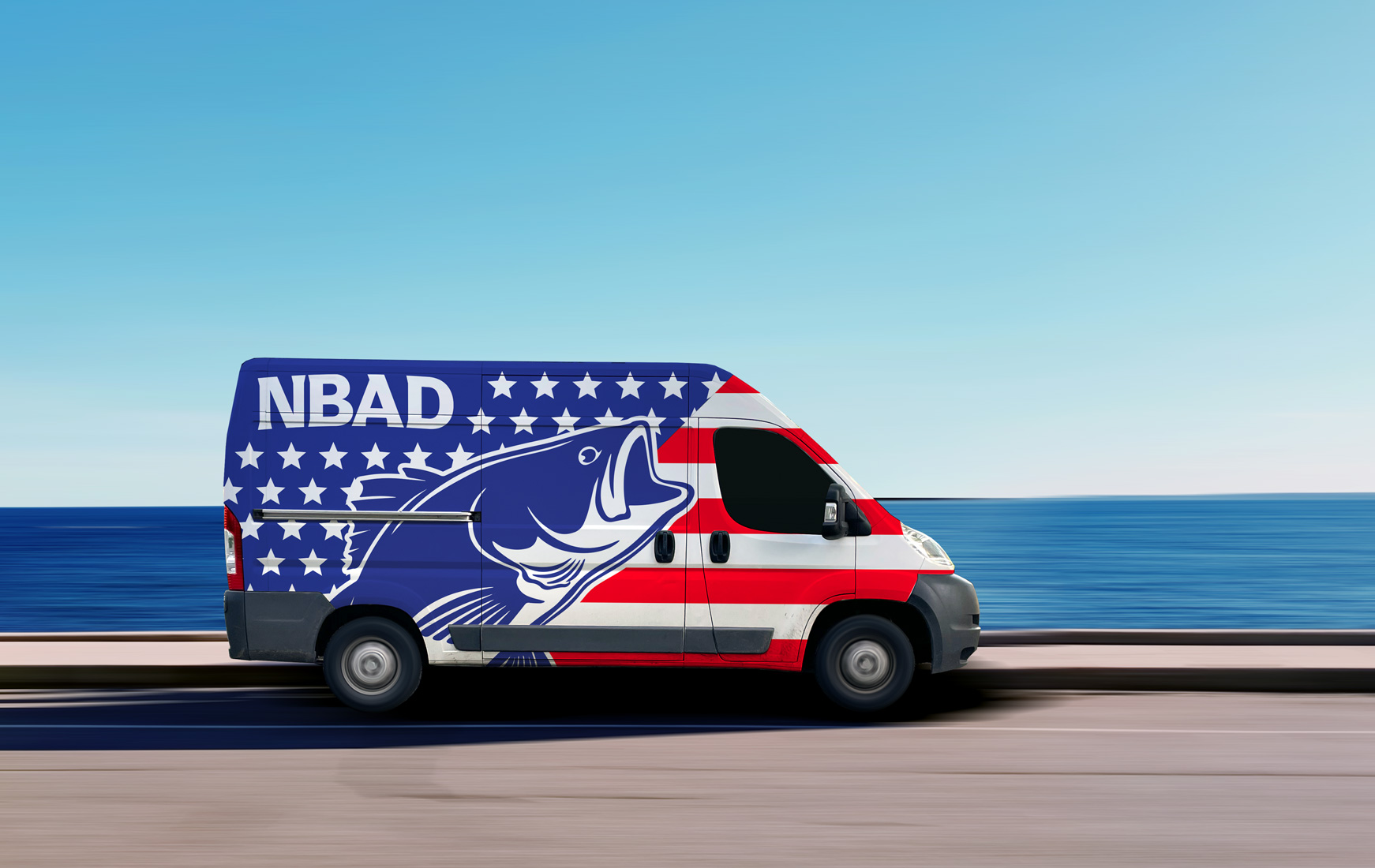
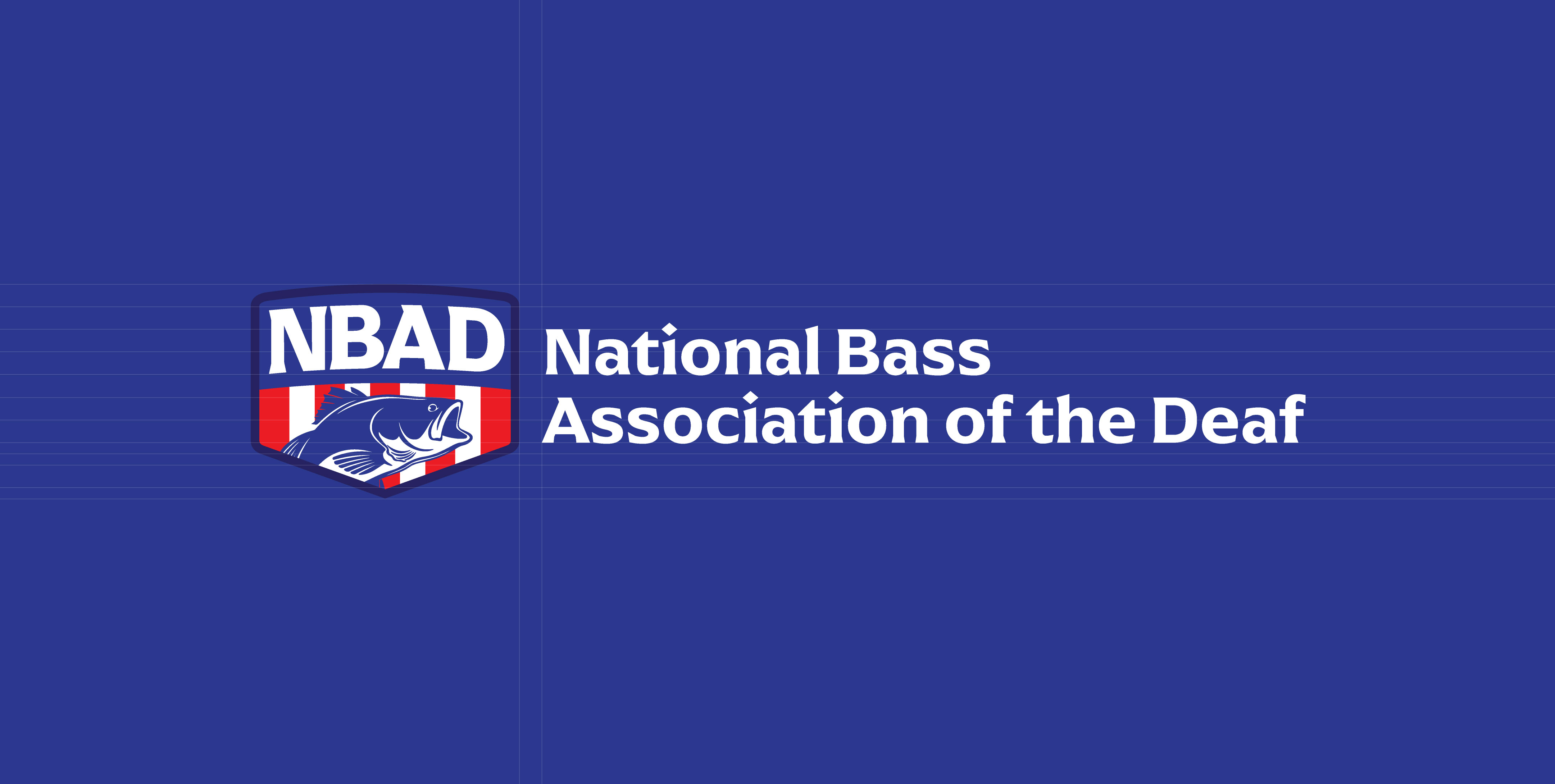
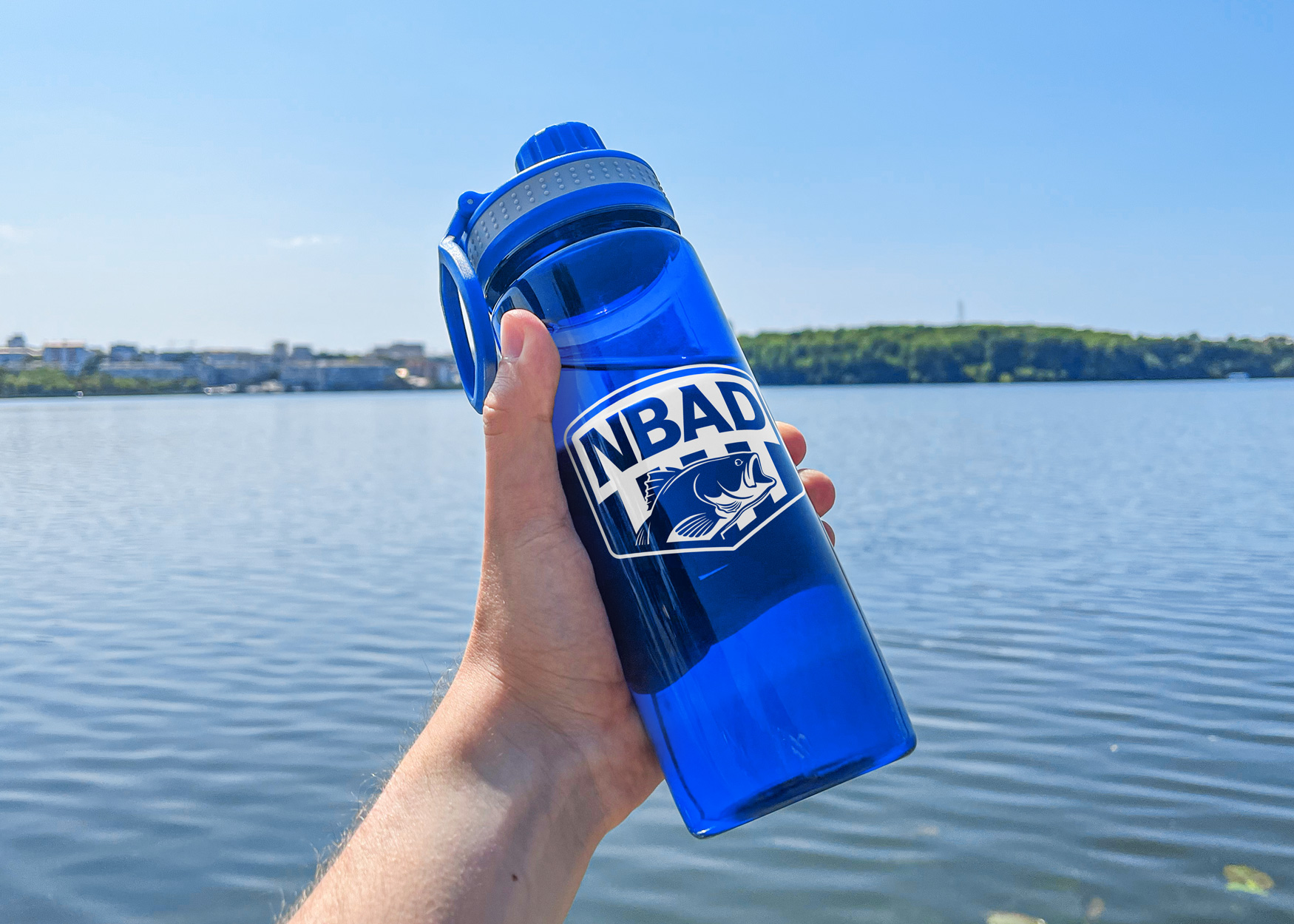
The final result is a modernized logo and identity system that feels confident, clear, and built for long term use. The refreshed mark works seamlessly across apparel, tournament materials, signage, and online platforms, giving NBAD a consistent and professional presence.
The new identity strengthens visibility at events while honoring the organization’s legacy and community roots. It reflects both the competitive spirit of the tournaments and the strong sense of belonging that defines NBAD.
After launch, leadership shared positive feedback about the cleaner look and improved usability, noting that the updated design better represents the organization today and supports future growth.
Ready to leap forward?
Your brand deserves to be seen. I am ready when you are.